Smart starts here.

Raynaud & Co is a Cybersecurity consultancy company that empowers organisations around the world to build intelligent security processes, freeing up security and dev teams to focus on the most important IT issues and accelerate innovation.
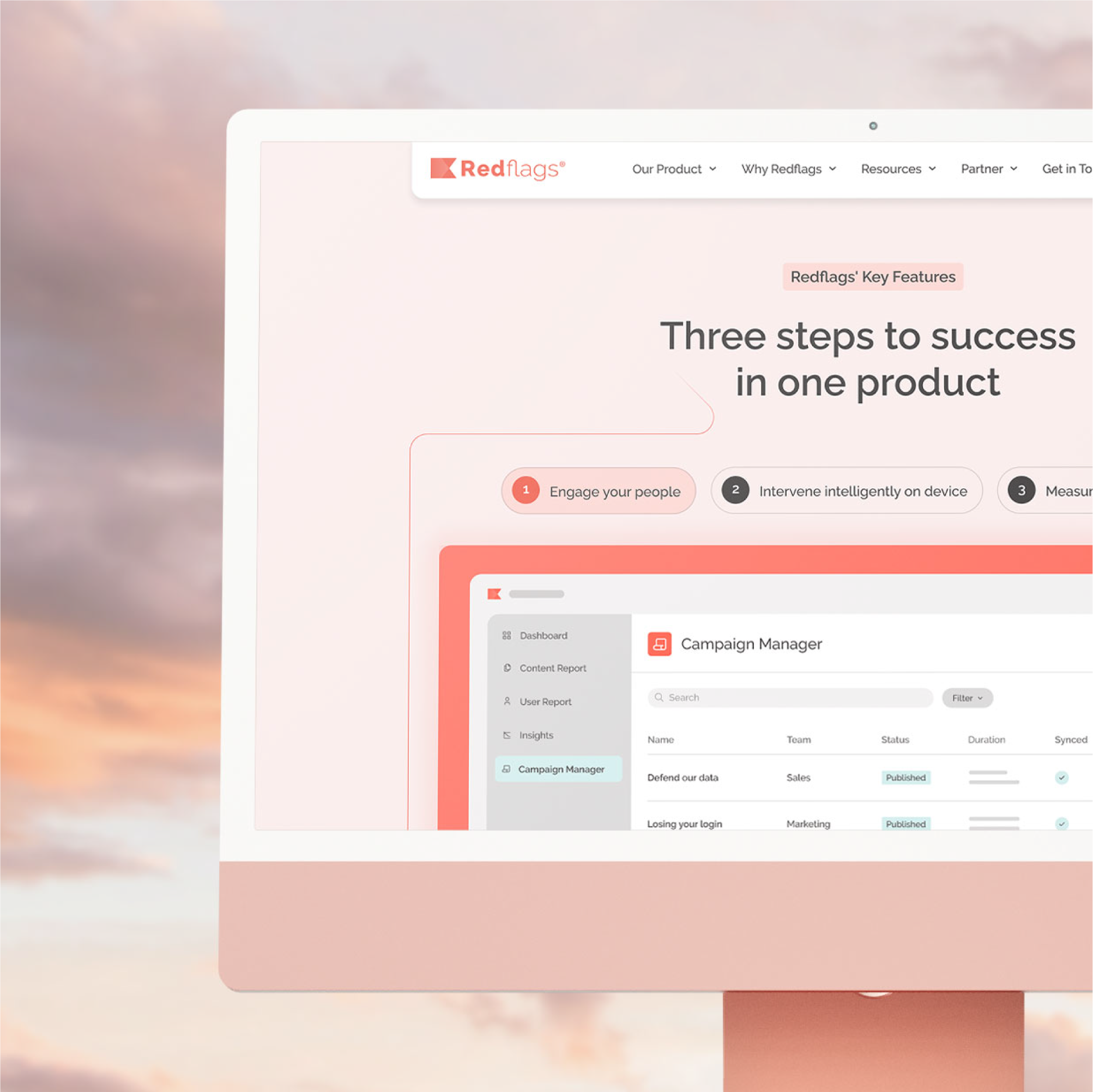
The company needed a brand identity and website that would reflect its innovative security approach — smart, trustworthy, and dynamic. Working closely with the team, I developed a flexible design system and visual identity that communicates expertise without being overwhelming.


The Raynaud & Co logo icon was designed using an isometric grid, reflecting precision and structure – key principles in cybersecurity. From this foundation, a stylized letter “R” was crafted, creating a dynamic form that represents adaptability, innovation, and the layered complexity of cybersecurity.
The logo features a bold, modern typeface, ensuring clarity and professionalism. This approach reinforces Raynaud & Co’s identity as a cutting-edge cybersecurity consultancy, committed to delivering secure, forward-thinking solutions.


Raynaud & Co represents expertise, trust, and innovation in cybersecurity and delivers a hands-on, strategic approach to tackling complex cyber challenges. The brand is here to reinforce the consultancy’s mission: to help businesses stay ahead of cyber risks by implementing intelligent, forward-thinking security solutions.


If you like what you see and think we’d be a good fit, let’s make something great together. Whether you’re refining an existing brand or starting fresh, I’d love to hear more about your project.