Level up your Appsec game.


Application security can be serious business — but the community around it doesn’t have to be. ZAPCon is the annual user conference for ZAP, the world’s most widely used web app scanner. The team behind ZAP needed a brand identity and website for their flagship event that felt fresh, fun, and accessible, while still delivering the professionalism and clarity expected by the global AppSec community.

Among three initial concepts, an 80s retro theme emerged as the winner – a fusion of vibrant sunset colours and classic arcade visuals.
Building on ZAP’s existing brand identity (including its logo, colours, and illustrations) a dedicated visual identity was developed for the conference. The goal was to seamlessly blend the new event branding with ZAP’s original look. A custom conference logo was designed, merging the core ZAP logo with the 80s retro theme.
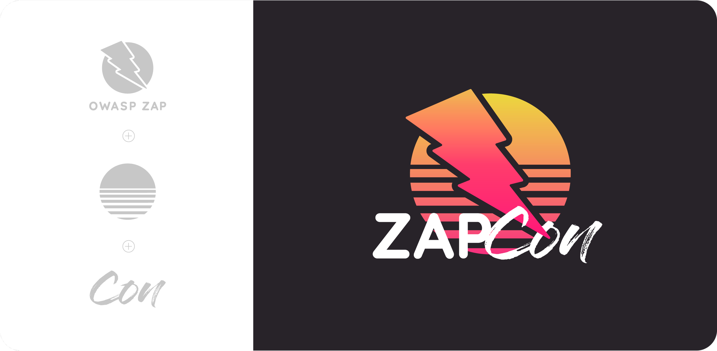

The original colour palette was expanded with four additional hues to capture the vibrant, high-energy feel of classic 80s arcade visuals.


The ZAPbot, ZAP’s beloved mascot, was reimagined to fit the theme, adding a playful and dynamic touch throughout the designs.
Embracing the overall aesthetic, we integrated gamification elements throughout the website. Users could select a custom ZAPbot illustration during registration, while a life counter graphic in the navigation playfully decreased with each page reload. Game-inspired animations further enhanced the interactive experience.


The website serves as the first point of contact for attendees, providing key details such as speaker information, the event agenda, registration, and the call for papers. The visual identity embraces ZAP’s playful and quirky spirit, ensuring the event stands out in the cybersecurity space.


If you like what you see and think we’d be a good fit, let’s make something great together. Whether you’re refining an existing brand or starting fresh, I’d love to hear more about your project.